Apple’s most sweeping software redesign disappoints mainland Chinese consumers
Technology
47
Beiträge
40
Kommentatoren
63
Aufrufe
-
Get the fuck outta here with that! Any red blooded microphile knows XP was PEAK windows experience. The lower opacity of windows in Vista was a bright spot in an otherwise disgusting experience.
XP was “the Linux” of Windows releases…

-
I share the same feeling. The flat lifeless interfaces need to go.
-
This post did not contain any content.
Apple’s most sweeping software redesign disappoints mainland Chinese consumers
The hashtag ‘iOS26 Ugly’ was microblogging app Weibo’s top-trending topic on Tuesday, as thousands of netizens expressed their discontent.

South China Morning Post (www.scmp.com)
This article really needs some illustration of what the new UI looks like, and what the old one looks like for comparison
-
This post did not contain any content.
Apple’s most sweeping software redesign disappoints mainland Chinese consumers
The hashtag ‘iOS26 Ugly’ was microblogging app Weibo’s top-trending topic on Tuesday, as thousands of netizens expressed their discontent.
South China Morning Post (www.scmp.com)
I bet it's going to drain more power, since you have to render all the diffraction in real time...
-
This article really needs some illustration of what the new UI looks like, and what the old one looks like for comparison
the new one looks like shit.
-
The whole update being design focused is kinda disappointing. But the Liquid Glass UI does look kinda intriguing. I'm glad to get back a little of the old Skeuomorphism of old.
Though I don't have any Apple stuff at the moment
you spelled Liquid Ass wrong.
-
This post did not contain any content.
Apple’s most sweeping software redesign disappoints mainland Chinese consumers
The hashtag ‘iOS26 Ugly’ was microblogging app Weibo’s top-trending topic on Tuesday, as thousands of netizens expressed their discontent.
South China Morning Post (www.scmp.com)

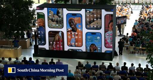
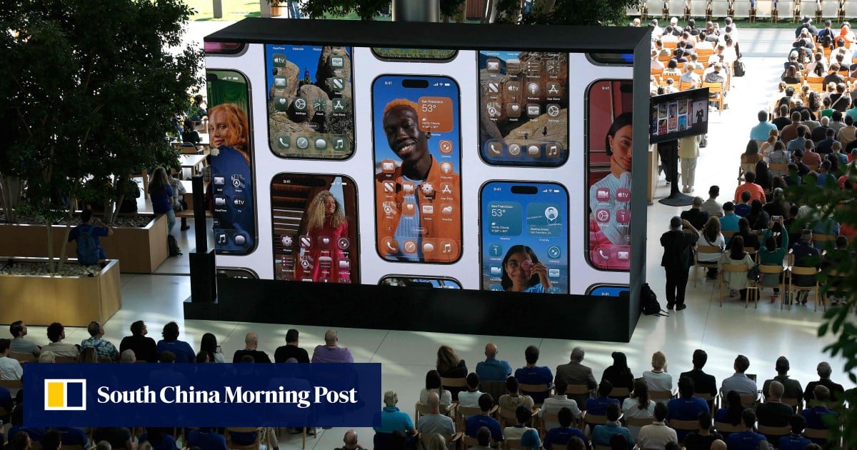
Apple introduces a delightful and elegant new software design
Apple previewed a new software design, crafted with Liquid Glass, that makes apps and system experiences more expressive and delightful.
Apple Newsroom (www.apple.com)
-
This post did not contain any content.
Apple’s most sweeping software redesign disappoints mainland Chinese consumers
The hashtag ‘iOS26 Ugly’ was microblogging app Weibo’s top-trending topic on Tuesday, as thousands of netizens expressed their discontent.
South China Morning Post (www.scmp.com)
If this were an optional "skin" of sorts, it would have been completely fine with me. But this is a forced redesign, and a really bad one at that. There will likely be changes before the GM release comes out, but overall I just don't like the design direction, nor the performance implications
-
Sorry, I really don‘t mean to be rude or hurtful, but from all I‘ve seen and I mean ALL I‘ve seen Chinese consumers have no taste whatsoever. Yes, their manufacturing has become great if they actually care about something but this argument is not about stability. What I mean is the more a company relies on the Chinese market and tailors their commodities abd luxury products around Chinese consumers, the uglier they become. Just look at European cars lately. Hideous. So yeah sorry again but I take that as a seal of quality for Apple‘s UI design.
I knew it. I knew someone would manage even the most innocuous news into a "China Bad" take.
-
The whole update being design focused is kinda disappointing. But the Liquid Glass UI does look kinda intriguing. I'm glad to get back a little of the old Skeuomorphism of old.
Though I don't have any Apple stuff at the moment
Yeah I actually liked the whole Vista/7 era Windows looks. Didn't like anything else about Vista but that wasn't Windows Aero's fault.
-
This post did not contain any content.
Apple’s most sweeping software redesign disappoints mainland Chinese consumers
The hashtag ‘iOS26 Ugly’ was microblogging app Weibo’s top-trending topic on Tuesday, as thousands of netizens expressed their discontent.
South China Morning Post (www.scmp.com)
And most other consumers, I would wager.
-
Apple: adds blur effects, rounded elements, and color themeing
Homo Sapians: "Wow, another groundbreaking idea from Apple!"
It's not just blur though, it actually refracts what's behind the element, which sounds more performance intensive than it needs to be, and sometimes it's heavily distracting, but let's not kid ourselves that this is just windows vista on a Mac, they're emulating more of the physicalities of glass than just a static shine
-
This post did not contain any content.
Apple’s most sweeping software redesign disappoints mainland Chinese consumers
The hashtag ‘iOS26 Ugly’ was microblogging app Weibo’s top-trending topic on Tuesday, as thousands of netizens expressed their discontent.
South China Morning Post (www.scmp.com)
What people really want is less control and cat videos. Perhaps a screen with two knobs on the side...one for the volume and the other to change the picture?
-
Apple introduces a delightful and elegant new software design
Apple previewed a new software design, crafted with Liquid Glass, that makes apps and system experiences more expressive and delightful.
Apple Newsroom (www.apple.com)
Those damn corners weren’t round enough yet, thanks Apple designers

-
Sure, I just don’t think it’s really that much different than what we have now. I guess I’m just indifferent to it and don’t think it’s that big of a change.
after using it for a bit, i’d say in most cases i agree: bit of a nothing burger in a lot of cases (to the point where a few times i’ve thought it was bugged and reverted to the old UI style… it wasn’t), but it’s pretty great when it comes to apps where the UI is secondary (content etc)… the diffraction in the UI rather than a blur makes the whole UI able to be ignored much easier, and IMO it’s still about as legible in most real scenarios
-
Y'all don't see this?
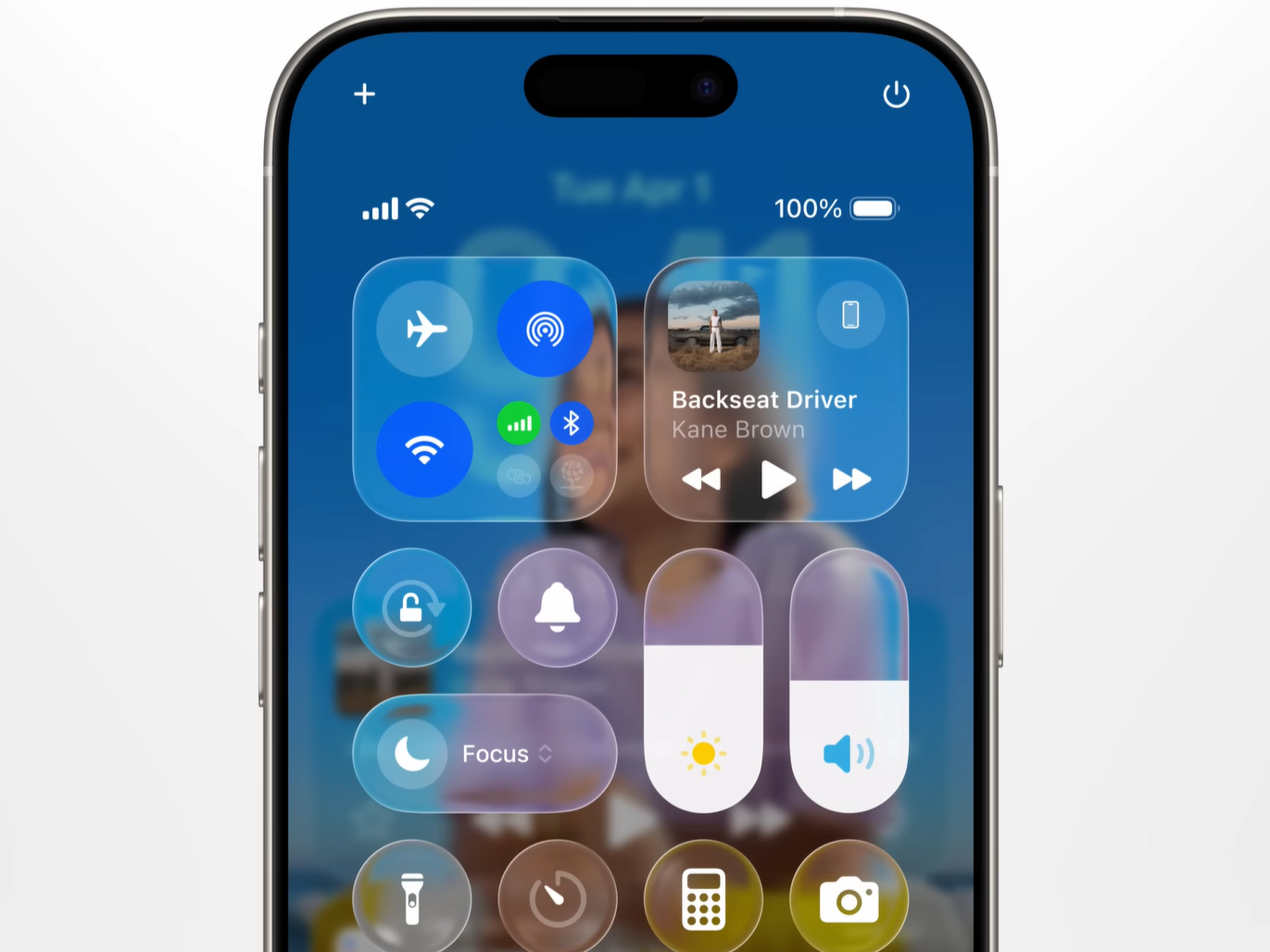
I like the way it flwobs her face, but where there aren’t distinct background shapes, it’s like a glass of water on a plain background, just kind of a dull nothing.
The more I look at it, it’s making me feel a bit queasy actually
-
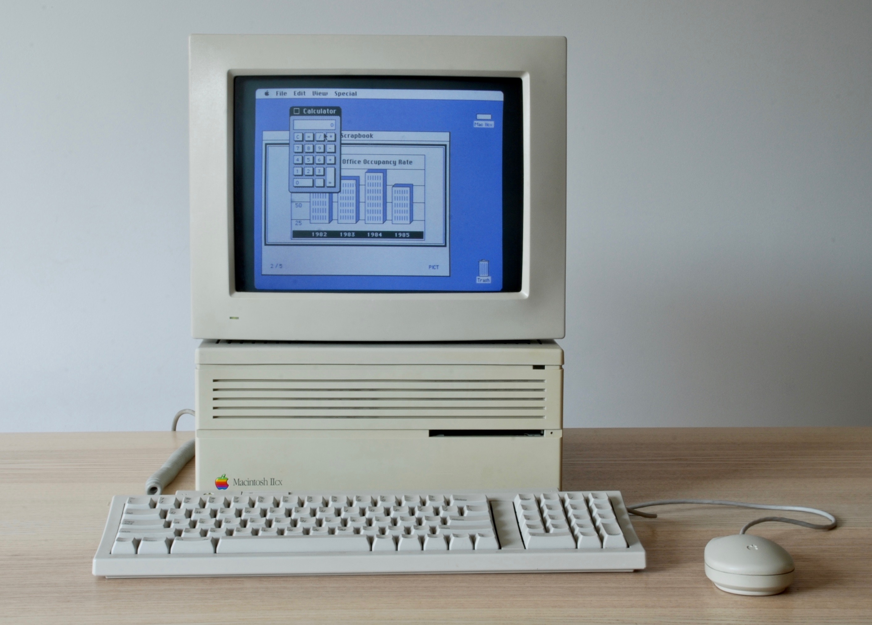
I think there was some sort of color support prior to System 7.
kagis
System 6 includes QuickerGraf (originally QuickerDraw), system software used to accelerate the drawing of color images on the Macintosh II.
Hmm. Apparently System 4 had color support, which is earlier than I expected.
...it wasn't until two years later in 1987 that Apple introduced color with the release of the System 4 & the Macintosh II.
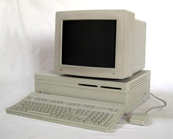
Here's a photo of a IIcx with a color display:
They’re going for X with L-aqua-d Glass, but look at 7, so brutalist chill
-
They’re going for X with L-aqua-d Glass, but look at 7, so brutalist chill
This was 4, my bad, both tho
-
Aqua, an OS X theme from before you were born

It’s SO cool!
-
Y'all don't see this?
I’ll have to have greyscale wallpaper.