This is a very long topic title intended to test the banner rendering behavior when multiple images are included in the first post of a NodeBB topic in version 4.4.1
ActivityPub Test Kategorie
5
Beiträge
4
Kommentatoren
1
Aufrufe
-
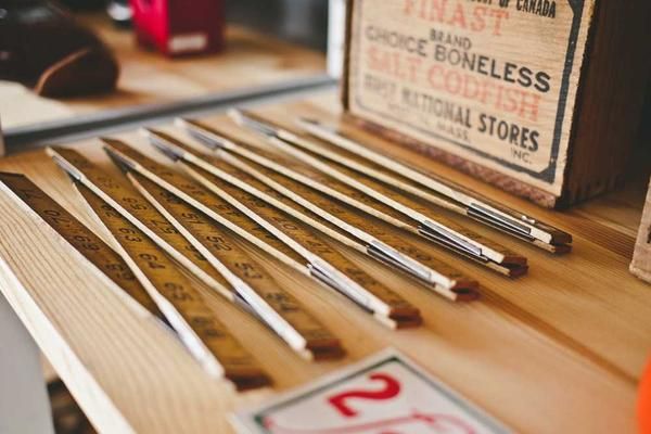
Here is a test post containing multiple images to reproduce the banner issue in NodeBB 4.4.1. You should see all of these images in the topic banner area, side by side, causing horizontal scrolling.


-
Here is a test post containing multiple images to reproduce the banner issue in NodeBB 4.4.1. You should see all of these images in the topic banner area, side by side, causing horizontal scrolling.
It shows differently on my pc and laptop depending on screen-size, but
What is the purpose of having 'summary thumbnails' of all images, next to the title??
If there needs to be an image for some reason, couldnt it just be the first one?In one screen it goes long way off the screen in a line, and the page is extended horizontally
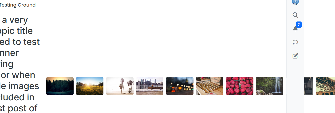
On other goes in a block


-
Here is a test post containing multiple images to reproduce the banner issue in NodeBB 4.4.1. You should see all of these images in the topic banner area, side by side, causing horizontal scrolling.
Nodebb Admins use Desktop, but 98% of user interaction is via mobile anyway.
Is there a way to turn off this 'photo summary' on mobile view? -
Here is a test post containing multiple images to reproduce the banner issue in NodeBB 4.4.1. You should see all of these images in the topic banner area, side by side, causing horizontal scrolling.
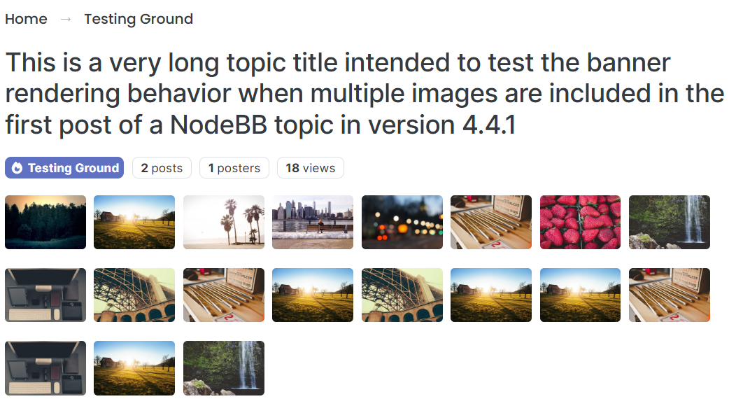
Fixed an issue in harmony so the thumbs don't overflow on desktop.
As for why they are all displaying as thumbs I think that was something julian changed recently. Not sure about the details, could be for the feed plugin or activity pub.
-
Fixed an issue in harmony so the thumbs don't overflow on desktop.
As for why they are all displaying as thumbs I think that was something julian changed recently. Not sure about the details, could be for the feed plugin or activity pub.
eeeee this blog post should shed some light on my decision-making, but I'm open to changes!
