Apple’s most sweeping software redesign disappoints mainland Chinese consumers
Technology
47
Beiträge
40
Kommentatoren
796
Aufrufe
-
This post did not contain any content.
Liquid ass
-
This post did not contain any content.
I guess I'm from China then
-
Pretty sure it disappointed most people
Yeah, I used to be a typical Apple fanboy circa 2010, always watching the WWDC like I’m going to church.
Keeping up with Apple over the past several years has been very hit or miss, and watching it yesterday just kind of pissed me off.
-
This post did not contain any content.
Sorry but any article about what internet users are saying about any topic is not real news. It’s not even noteworthy.
-
Not Apple fans though. They can't wait to use their new Vista!
Aqua, an OS X theme from before you were born

-
I just checked the Apple website and it doesn’t really look any different to me.
I can see there are changes, but I don’t even know if the average user will really notice it.
Did the same thing the other day, there’s like some minor icon redesigns? Otherwise this mostly seems like people made up stuff.
-
Aqua, an OS X theme from before you were born
I thought it couldn’t get better when System 7 had color support. It was such a revolution. Then Aqua came along and everything changed. Liquid Glass looks pretty nice to me but I’m mostly just glad we’re getting dimension back. Material flat UI is a stain on the world.
-
Did the same thing the other day, there’s like some minor icon redesigns? Otherwise this mostly seems like people made up stuff.
I saw some things in the videos, but I guess I don’t really care about design too much. So maybe that’s why I don’t care. I’ll have to ask my wife what she thinks.
-
Liquid ass
You know
-
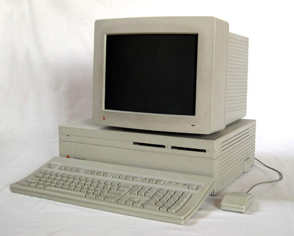
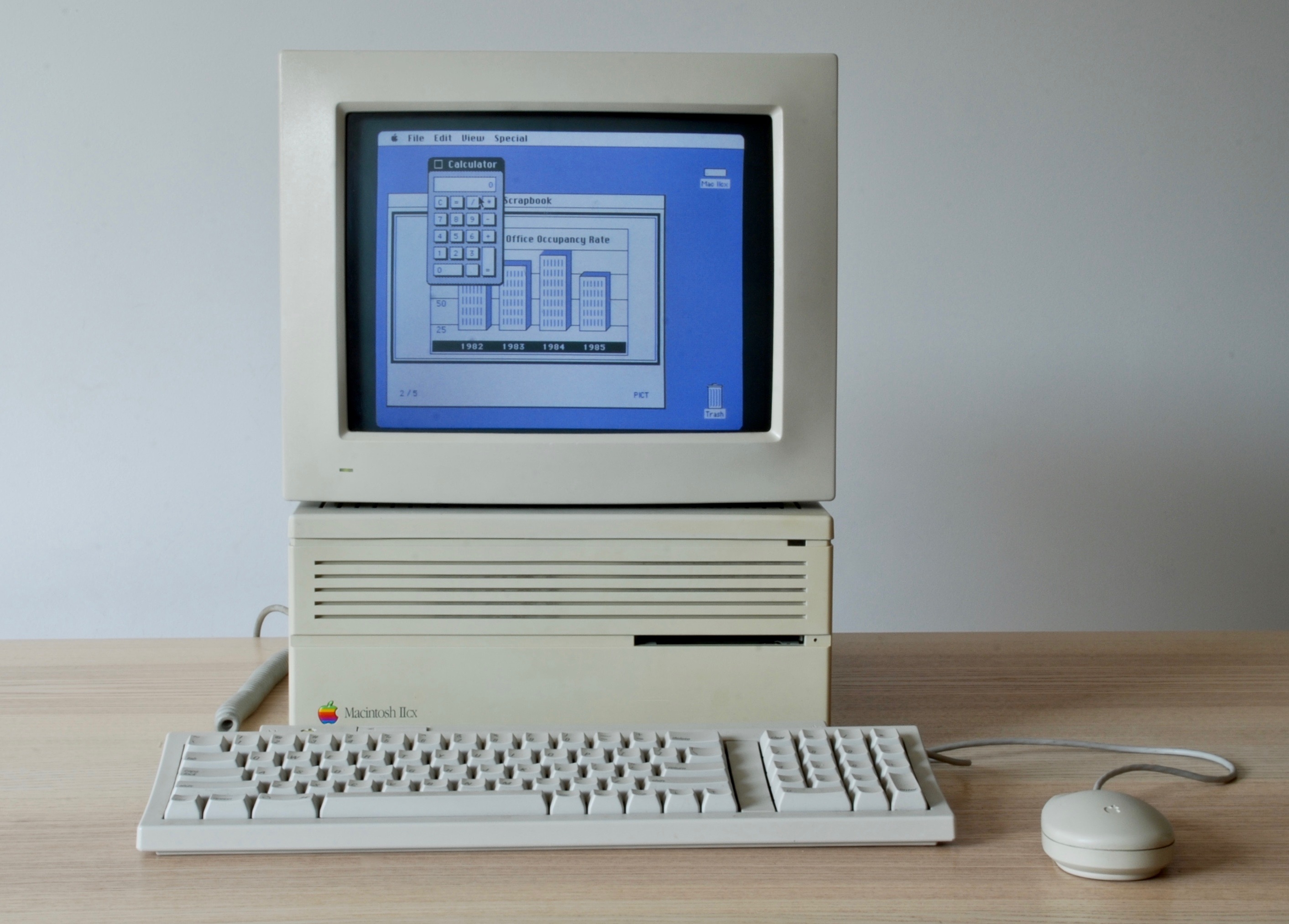
I thought it couldn’t get better when System 7 had color support. It was such a revolution. Then Aqua came along and everything changed. Liquid Glass looks pretty nice to me but I’m mostly just glad we’re getting dimension back. Material flat UI is a stain on the world.
I think there was some sort of color support prior to System 7.
kagis
System 6 includes QuickerGraf (originally QuickerDraw), system software used to accelerate the drawing of color images on the Macintosh II.
Hmm. Apparently System 4 had color support, which is earlier than I expected.
...it wasn't until two years later in 1987 that Apple introduced color with the release of the System 4 & the Macintosh II.
Here's a photo of a IIcx with a color display:
-
This post did not contain any content.
The whole update being design focused is kinda disappointing. But the Liquid Glass UI does look kinda intriguing. I'm glad to get back a little of the old Skeuomorphism of old.
Though I don't have any Apple stuff at the moment
-
This post did not contain any content.
The platform saw more than 20,000 mainland netizens express their discontent over the new design.
Halt everything!! 20k people saying things on the internet!!
-
I just checked the Apple website and it doesn’t really look any different to me.
I can see there are changes, but I don’t even know if the average user will really notice it.
Y'all don't see this?
-
This post did not contain any content.
Sorry, I really don‘t mean to be rude or hurtful, but from all I‘ve seen and I mean ALL I‘ve seen Chinese consumers have no taste whatsoever. Yes, their manufacturing has become great if they actually care about something but this argument is not about stability. What I mean is the more a company relies on the Chinese market and tailors their commodities abd luxury products around Chinese consumers, the uglier they become. Just look at European cars lately. Hideous. So yeah sorry again but I take that as a seal of quality for Apple‘s UI design.
-
Y'all don't see this?
Sure, I just don’t think it’s really that much different than what we have now. I guess I’m just indifferent to it and don’t think it’s that big of a change.
-
Sorry, I really don‘t mean to be rude or hurtful, but from all I‘ve seen and I mean ALL I‘ve seen Chinese consumers have no taste whatsoever. Yes, their manufacturing has become great if they actually care about something but this argument is not about stability. What I mean is the more a company relies on the Chinese market and tailors their commodities abd luxury products around Chinese consumers, the uglier they become. Just look at European cars lately. Hideous. So yeah sorry again but I take that as a seal of quality for Apple‘s UI design.
I completely agree.
I see no reason to take their criticisms seriously. Have you ever seen a chinese website?
-
Y'all don't see this?
I like the direction, but I’d need the transparency to be dialled down a bit cause the contrast is missing.
-
Get the fuck outta here with that! Any red blooded microphile knows XP was PEAK windows experience. The lower opacity of windows in Vista was a bright spot in an otherwise disgusting experience.
XP was “the Linux” of Windows releases…

-
I share the same feeling. The flat lifeless interfaces need to go.
-
This post did not contain any content.
This article really needs some illustration of what the new UI looks like, and what the old one looks like for comparison