Apple sues YouTuber who leaked iOS 26’s new “Liquid Glass” software redesign
Technology
72
Beiträge
50
Kommentatoren
0
Aufrufe

-
According to the filing, Lipnik has been fired from Apple “for failing to follow Apple’s policies designed to protect its confidential information, including development devices and unreleased software and features.” The filing also accuses Lipnik of failing to report “multiple prior breaches” to Apple.
When you sign an NDA (non-disclosure agreement), you’d best protect the secrets. Then again, the guy who left an iPhone 4 in a bar didn’t lose his job. Wonder what the differences are between them.
Apple sues YouTuber who leaked iOS 26’s new “Liquid Glass” software redesign
YouTuber claims to “have receipts” disproving Apple’s allegations.

Ars Technica (arstechnica.com)
The difference between this and the iPhone 4 leak might just be company policy. I'm sure Apple's rules for handling prototypes got stricter after the first leak, so this guy probably broke more rules than the first, even if they did basically the same thing.
-
Interesting to read that they actually fired the engineer this time. The last time this was reported (more recent than the phone proto left at the bar), Apple didn’t fire the responsible engineer. I guess that person was too important to let go.
This time it was a willful and intentional leak (at least if you believe the article's version of the events), whereas the guy who left the prototype at the bar was a complete accident. It's not surprising to me that Apple would fire someone who intentionally leaked something. As for the guy who left the phone at the bar, I guess it depends on how careless and negligent you think that was.
-
Gross. Why in the world would anyone want translucent icons?
Yes I'd like to strip away my ability to quickly sort mentally by color and I'd love it if there was a background image partially visible intermixed with the thing I'm looking for.
Windows phone was peak UI. I don't think transparency even needs to be a thing in an OS.Microsoft changing Outlook from gold to yet another blue blob. Google changing every single goddamn app to use the same red/yellow/green/blue pallet. And now this bullshit.
-
Gross. Why in the world would anyone want translucent icons?
Yes I'd like to strip away my ability to quickly sort mentally by color and I'd love it if there was a background image partially visible intermixed with the thing I'm looking for.
Windows phone was peak UI. I don't think transparency even needs to be a thing in an OS.I’ve unironically seen both positive and negative reactions from people.
-
Microsoft changing Outlook from gold to yet another blue blob. Google changing every single goddamn app to use the same red/yellow/green/blue pallet. And now this bullshit.
I mean, outlook has themes… but I generally hate their other recent UI changes.
-
Gross. Why in the world would anyone want translucent icons?
Yes I'd like to strip away my ability to quickly sort mentally by color and I'd love it if there was a background image partially visible intermixed with the thing I'm looking for.
Windows phone was peak UI. I don't think transparency even needs to be a thing in an OS.Transparency is fine if it's used for stuff like the background of a window, since you'd want tod emphasize that anyways but I have to agree that using it for icons hurts usability so much.
-
Unless it's also a cfaa violation for exceeding access
I was thinking more this:
The Economic Espionage Act (EEA) of 1996 makes it a federal crime to steal trade secrets, with penalties including up to 10 years in prison and substantial fines
-
It would be a civil matter, not criminal.
The Economic Espionage Act (EEA) of 1996 makes it a federal crime to steal trade secrets, with penalties including up to 10 years in prison and substantial fines
-
Looks like shit IMO
I’m on the beta. And I started hating it, then went to disliking it to simply not preferring it.
Being in beta, they are still making tweaks. I think, somewhat unexpectedly, the final build will be kinda nice.
-
According to the filing, Lipnik has been fired from Apple “for failing to follow Apple’s policies designed to protect its confidential information, including development devices and unreleased software and features.” The filing also accuses Lipnik of failing to report “multiple prior breaches” to Apple.
When you sign an NDA (non-disclosure agreement), you’d best protect the secrets. Then again, the guy who left an iPhone 4 in a bar didn’t lose his job. Wonder what the differences are between them.
Apple sues YouTuber who leaked iOS 26’s new “Liquid Glass” software redesign
YouTuber claims to “have receipts” disproving Apple’s allegations.
Ars Technica (arstechnica.com)
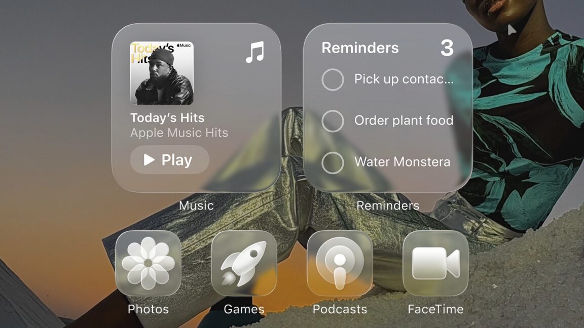
Just to clarify something, because I think the majority of people here only know what iOS 26 looks like from the thumbnail. Below is an actual screenshot of the iOS 26 beta running on my phone.
Just like Android, things are customisable and the icons in the thumbnail are the most egregious version of the new visuals. I find it hard to believe anyone will actually use that styling tbh.

-
The lack of color isn’t the default, it’s an option (an evolution of one that already have). By default everything is still colorful.
shh don’t spoil the apple hate circlejerk.
“Apple doesn’t give users enough choice!”
apple gives users choice.
“ew, why would they do that???”
-
Plot twist: the Liquid Glass redesign was just a decoy they hoped would get leaked as a distraction to maintain buzz during the long delays in their secret Transparent Aluminum redesign.
they’re still trying to teach Scotty how to use the computers. Siri still can’t understand him.
-
Just to clarify something, because I think the majority of people here only know what iOS 26 looks like from the thumbnail. Below is an actual screenshot of the iOS 26 beta running on my phone.
Just like Android, things are customisable and the icons in the thumbnail are the most egregious version of the new visuals. I find it hard to believe anyone will actually use that styling tbh.
Any level of UI element transparency is hard nope from me. Based on your screenshot, it looks like Apple was listening, on that front.
-
Ahhhh yes, I remember glass Opera.
I miss that and I mean more than just the Frutiger Aero aesthetics. I miss what I felt back then when opening the browser, not knowing what awaited me today but in a good way. Despite everything, tech companies promised us a digital future that wasn‘t entirely dreadful. In hindsight it was all just escapism of course and another cycle of that trend would just feel painfully cynical today. It can never be replicated. Big tech will forever be flat design at heart.
-
Just to clarify something, because I think the majority of people here only know what iOS 26 looks like from the thumbnail. Below is an actual screenshot of the iOS 26 beta running on my phone.
Just like Android, things are customisable and the icons in the thumbnail are the most egregious version of the new visuals. I find it hard to believe anyone will actually use that styling tbh.
Even the non glass icons look terrible, they include some automatic blur being applied.
-
Gross. Why in the world would anyone want translucent icons?
Yes I'd like to strip away my ability to quickly sort mentally by color and I'd love it if there was a background image partially visible intermixed with the thing I'm looking for.
Windows phone was peak UI. I don't think transparency even needs to be a thing in an OS.The icons in the article aren't even the default behavior. Mine all still have color. At least on the home screen and app drawer. The control center icons are translucent but those barely had any style before. And crucially, wifi, bluetooth etc buttons still have color to indicate status.
-
Always, but it won't stop people from flocking to upgrade and copying it, and wiþin 3 years it'll be filtering into Android and Gnome-first distributions will probably make it ðe default þeme.
th th th
-
Even the non glass icons look terrible, they include some automatic blur being applied.
I agree! But, I also think that might be some weirdness with how the system treats lighting on the normal icons compared to ones updated with their new materials in mind.
Almost all of the 3rd party app icons I have are various levels of blurry but the system icons seem fine.
-
Windows Vista, is that you?
Comically, Vista was criticized at the time for aping Apple’s Aqua. This clearly takes a lot from Aqua honestly.
All the major designers are borrowing from each other constantly. All roads eventually lead to NeXt.
-
Gross. Why in the world would anyone want translucent icons?
Yes I'd like to strip away my ability to quickly sort mentally by color and I'd love it if there was a background image partially visible intermixed with the thing I'm looking for.
Windows phone was peak UI. I don't think transparency even needs to be a thing in an OS.There’s an argument that increasing friction can help people addicted to their tech not get pulled in. Lots of apps designed to do that popping up with hard time limits and locks the last few years. Apple and Google are definitely aware that their design choices put them in the crosshairs at schools and employers. These sort of things pass the buck back.


